It's been a busy couple months with this project, and I'm finally ready to show off what I've been developing and learning. There's a lot to go over for this refactor, here is what I will be covering:
My motivation for taking this on was that I wasn't happy with how my current site looked, and I wanted to try some other frameworks that I had my eye on. This felt like a good time to fully redo the site from top to bottom, to demonstrate my project management skills and also to try my hand at designing a site in figma.
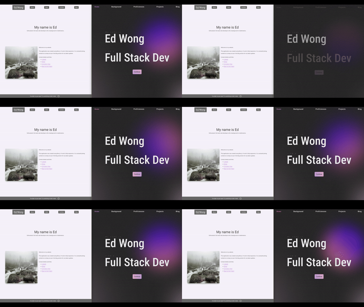
Before diving in, here's a before and after of the landing page. In my opinion, I think it has much improved and I am excited about where to take this next.

Before touching any code, my initial step was to figure out what I wanted to do and prioritise different features to ensure that I can get an MVP out the door in a sensible time, given I will be just working on this in my spare time. I first outlined everything that I eventually wanted to do, and broke that down into more sensible phases. The first phase encapsulates all the changes that this blog series will cover. Further enhancements to my portfolio will come down the line provided I don't get sidetracked by another project that I want to try!
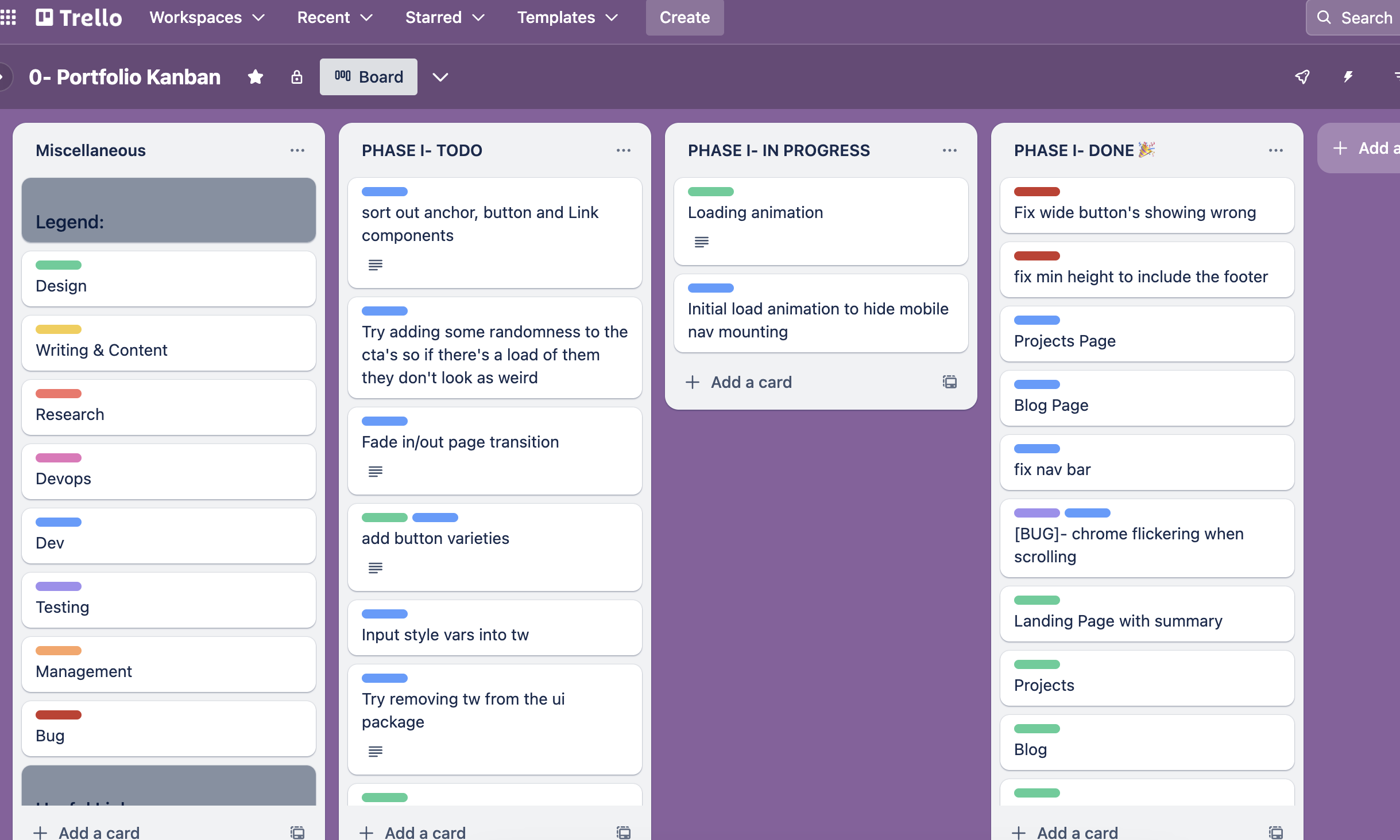
Next, I took the milestone goals of this phase and broke it up into further steps and created tasks on my kanban board:

This helped to give me context as to how much work was required and the different types that were required. As I was the solo developer and designer for this, I did not put a lot of detail into these tasks and found it was sufficient to just use single sentences to capture what I needed to do. I had the option here to give deadlines to each task, but found that life always has a way of getting in the way often and so I found that once I needed to postpone one task, it would have a huge knock-on effect which would mean a significant amount of time to managing my kanban board when really I just wanted to get on with the task at hand.
With all of this setup, I was excited to get started. First off, design.
I looked at my current website and tried to think what was wrong with it, or at least what I wasn't happy with. It felt incredibly flat, very boring and incredibly stationary. It felt half designed in that I wanted to achieve a glassmorphism effect, but there was not enough opportunity to use this effect to create any real depth in the pages. Based on this, I wanted to create a site that invoked a free-flowing yet professional feel. I wanted the site to feel like you were flowing through it with as few abrupt changes as I could achieve. I didn't want to add too many bells and whistles to this and thought that trying to keep things more minimal was a good option here.
My first step was to get inspiration from other sites with a similar look and feel to what I was after. While looking around on a variety of websites, I found these sites were good sources of inspiration for me:
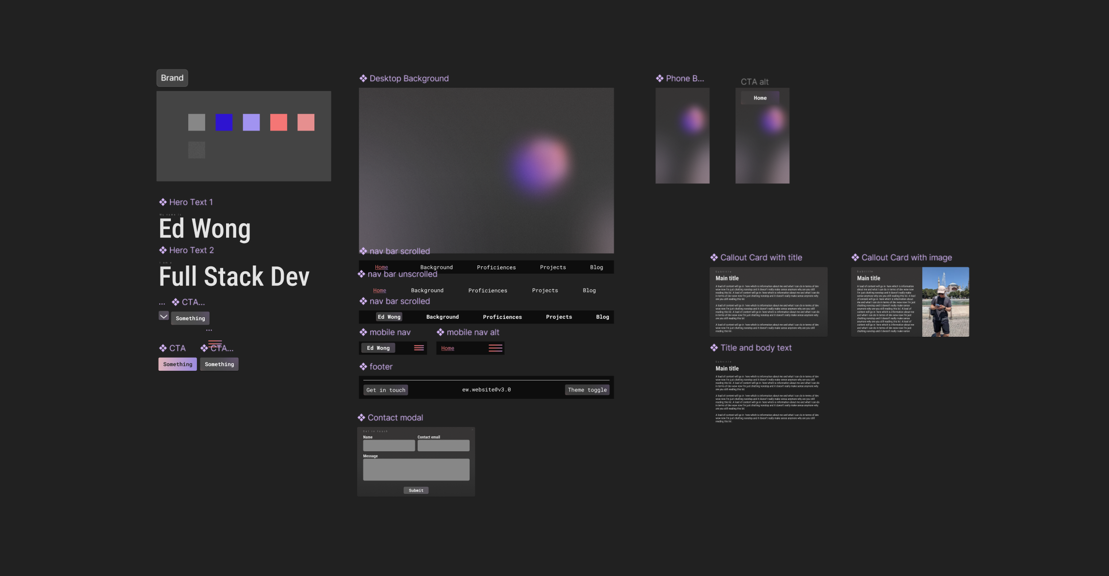
Taking this as inspiration, I started pulling together designs for a nice looking backdrop which would be consistently displayed throughout the whole site. I have not used Figma before to design anything, but I am familiar with using it from following them to create other websites, so after a few tutorials, I got stuck in. Here's what my initial components board looks like:

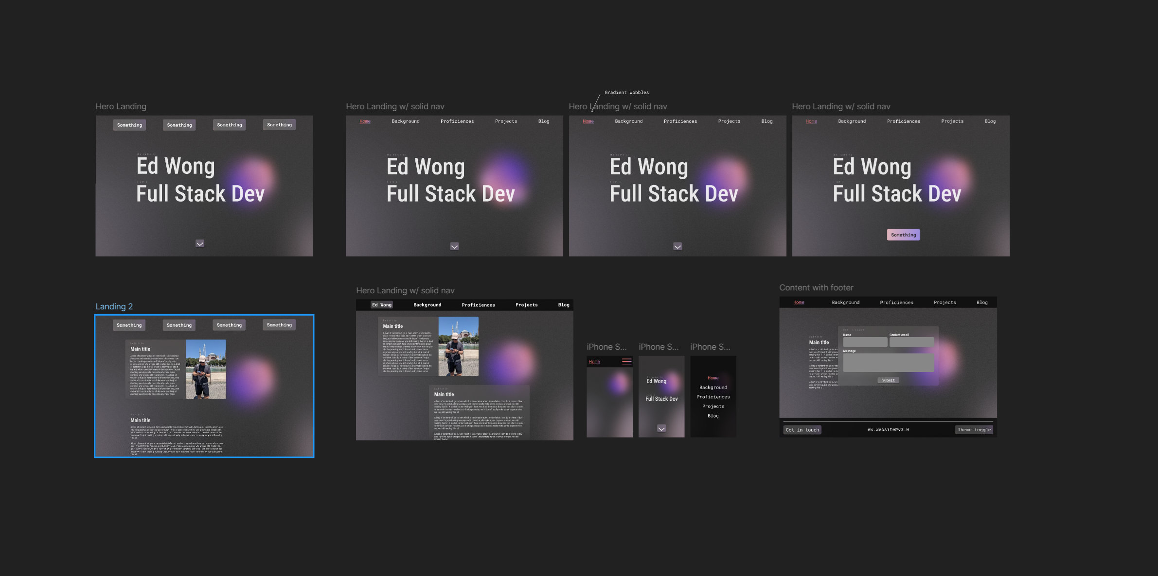
Note that whilst the designs here are certainly not exhaustive of all the components that I need throughout the site, this was a good start to combine these parts together to see if this was what I was after, without the constraint of figuring out styling directly in my application. I then started putting together the landing page and an example content page. Here are the page designs:

I then took this further by adding animations to designs to see if I could capture the free-flowing flowing clean feeling I was after. From looking at these results, I was very happy with the look and feel of this. I think that this was a good starting point to begin development as I had a good base with enough of the design language established to be able to confidently develop the rest of my site.
This process took about a week or two, which was significantly quicker than making something from scratch in React and tweaking it until I achieved what I was after. I thoroughly enjoyed this part of the project and it was a nice change of pace!
This concludes the first part of the refactor journey, in part 2 I will be covering the code section of the refactor and redesign.
Written by Ed with no LLM assistance, Keep on codin' ✌️