Refactoring and redesigning my website into a monorepo- part 2
In the previous part, I went over the first half of the redesign and refactor. That involved scoping the project by using a kanban board to manage everything properly and also designing the website in Figma. In this part, we will be covering everything on the coding side. We also mentioned previously that the work done will be in a monorepo, specifically using Turborepo. First of all, let's provide a little context and motivation.
Why bother with a monorepo?
In the situation where we are required to manage many different microservices that all have dependencies to our own managed packages, then managing these microservices within separate repositories can quickly get out of control. For instance say we need to update a package and we are required to push that change to all of the microservices that depend on it, then it would be a pain to update these services.
This isn't to say that it's always going to be the solution to every scenario. For instance, if the team size is large then it would become more cumbersome to manage everything inside a single repository. However, if the team is small enough, then this wouldn't be too much difficulty and would probably be much easier to manage that way. There are very valid reasons for and against a monorepo, making it extremely dependent on the environment of the projects.
I have not worked in a monorepo before so, in my case, I think it was a good opportunity to give it a go and see what I can earn from the process. Also, creating a monorepo for my side projects would allow for subsequent side projects down the line to share a unified design language using the same UI components, various configurations and utility libraries. For a team size of one, I think that a monorepo makes a lot of sense!
So let's get started with Turborepo.

What will my monorepo look like?
Ok so let's outline what we want the structure to be:
- Packages:
- UI library- this will contain the custom react components that I will be able to reuse in other projects. The aim is to make these as generic and reusable as possible.
- Eslint config- this will keep linting between the projects consistent. I have kept this to the default Turborepo template.
- Tailwind config- for defining and extending custom brand variables and any specific theming that will be used across my projects. Each project will define their own Tailwind config that will extend this one.
- Typescript config- TSconfig for use across the projects. This is also kept to the default values from the Turborepo template.
- Applications:
- Storybook- presenting the components from the UI library using the Storybook framework.
- Website- my personal website and first proper application in this monorepo.
Perhaps down the line I will also migrate my CMS over (or try another one that piques my interest).
Building the application and reusing previous utils
Starting from a blank Next.js 14 project for the website application, I first imported over all of the backend logic for fetching data from my CMS. The CMS serving this site will not change so it made sense to keep it the same as the previous version. I felt that it worked well and did not need enhancing for the purpose of this refactor. Then looking at the structure of the website, it is very simple. So I created the relevant directories with the page.tsx files in them to build the correct routes. Ok so my barebones applications now needs some content and styling applied to it. Before doing anything directly in the application, I started creating a couple simple components in the UI package.
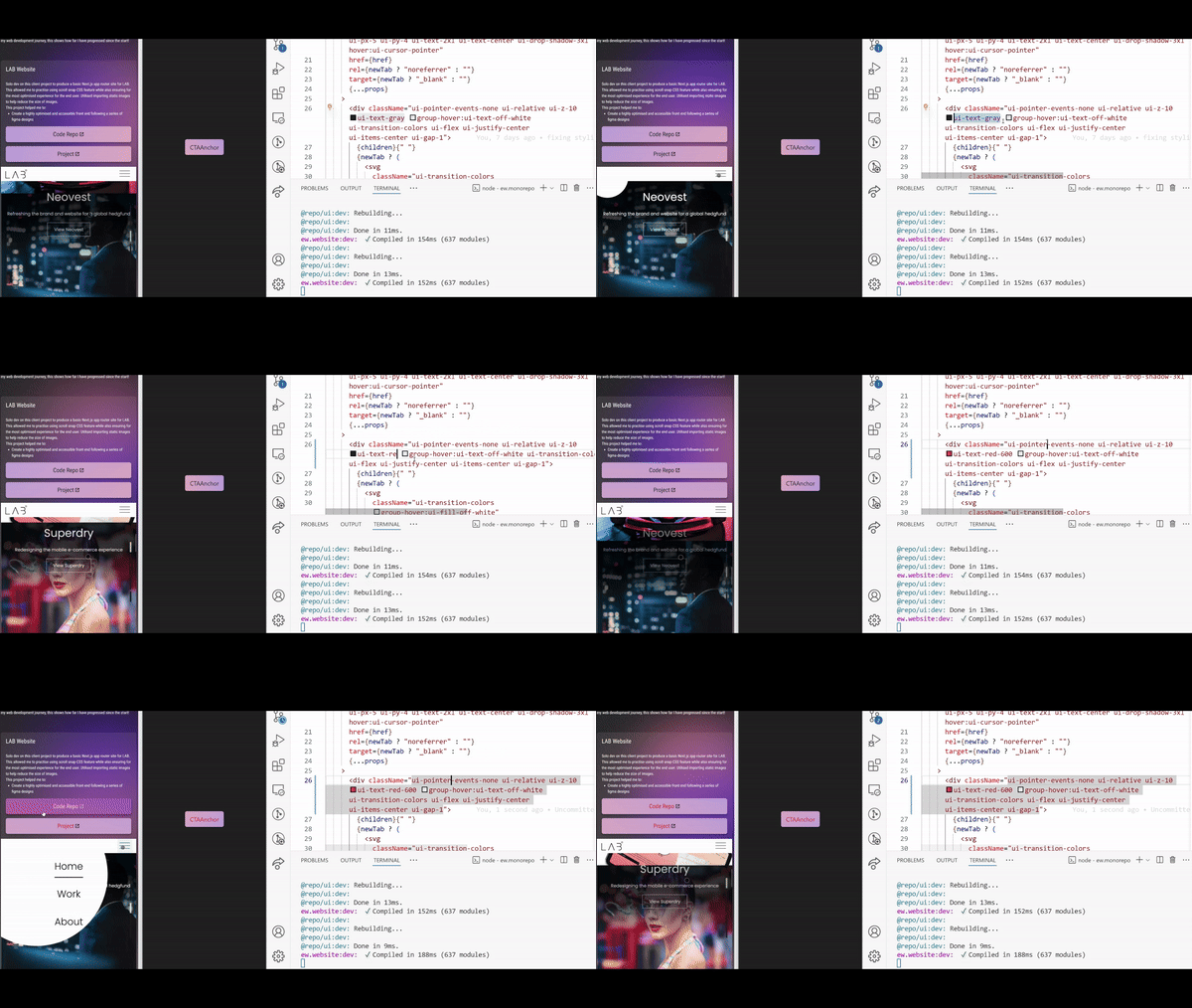
The previous application used Sass for styling, so anything that I was basing my new components off needed to be refactored. This did not take as long as I thought thanks to the simplicity of Tailwind. I always felt slightly overwhelmed with the idea of Tailwind but honestly, using it properly for the first time, it was really a piece of cake! I found it very quick to pick up mostly because of the super handy VSCode plugin Tailwind CSS IntelliSense. This would save me having to constantly refer to the docs. The IntelliSense even detects any custom variables imported from the Tailwind plugin which made things so much easier. I was developing these components by importing them into my Storybook project and then observing the result of the rendered component there. I am very familiar with Storybook and so there were no problems when using this to present my components. Then I imported these components into my main application, tweaking anything if needed in the UI library. This would of course update Storybook and the main application at the same time which is very neat!

After the components had been created, I started building the pages up with Tailwind. Again, Tailwind's simplicity and the fact that I never need to even leave my tsx file means that creating and styling pages is incredibly easy and fast.
Before, I used the Next.js loading.tsx feature, but I did not use the React Suspense boundary. I found that the latter was much more flexible as it allowed me to choose specific parts of the page that required data fetching instead of the entire page.tsx component. Note that for my application, you will rarely if ever see any loading skeletons because all the fetched data is cached anyway, but if data caching was not enabled for whatever reason, the skeletons will show as the server performs the fetch and streams the output to the front end.
I also added a new contact modal which allowed me to try a couple newer features that I had been wanting some exposure to. The first was server actions. This has been stable since Next.js 14 but I've yet to have a reason to use it until now. My server action validates the data received from the client and sends an email to the mailbox defined via the environment variables. All of this occurs in a separate server action file but is imported and called directly in the client component. My only concern with this particular new feature is that the network boundary is getting blurrier and blurrier. Once you get your head around where different code executes and how they are defined then I don't think it is as much of a problem but it could be an unnecessary learning curve for newer users to this paradigm. Apart from that, it's pretty neat to be able to call a server action directly on a client component. The second thing I wanted to try was the new @starting-style rule that has very recently started rolling out to many browsers. This would mean that I could transition the modal nicely between open and close, as well as transition the backdrop nicely too. I do not believe that there is any current support in Tailwind, so I had to do this the old fashioned way and put this straight into my global.css file. This was the only place where I used a dialog element so I could confidently scope it as such without risking breaking anything. Starting styles are great, albeit a little annoying with having to order things differently if working with pseudoelements, but otherwise, it's absolutely worth it to finally be able to transition these particular cases nicely! Credit to Kevin Powell on YouTube for a great explanation on using @starting-styles here.
I was now most of the way through with completing the website, just a few more things to address.
Finishing touches
I had always intended to add a webhook to my CMS to clear the cached fetched content. This was very easy to implement thanks to route handlers in Next.js. Firstly I removed the five minute cache that I had implemented previously (this was supposed to be a temporary solution that I never ended up changing until now!), by adding the force-cache option to the fetch. Note that this is the default option but I wanted to be explicit in the code so we can be clear what the caching behaviour is. Then I created a POST endpoint with the path /cache, and inside this I simply call the revalidateTags(...) method. Finally, I added this URL to the CMS webhook and set it to be triggered on every content update.
To test this, I built and started my project locally because Next will not perform production like caching in dev mode. As the CMS webhook was pointing to my deployed production application, I did not need to worry about it triggering when I did a content update. So, I made a small change to the content by just changing some punctuation and published it. On my local build, the content did not change which is what we expected, not until I hit my local cache endpoint with a POST request using insomnia. That request was successful, I refreshed the page and the content was updated! Perfect.
I could improve this in the future by creating specific tags for different sections of the site, but as I do not expect a whole load of traffic, I think this is sufficient.
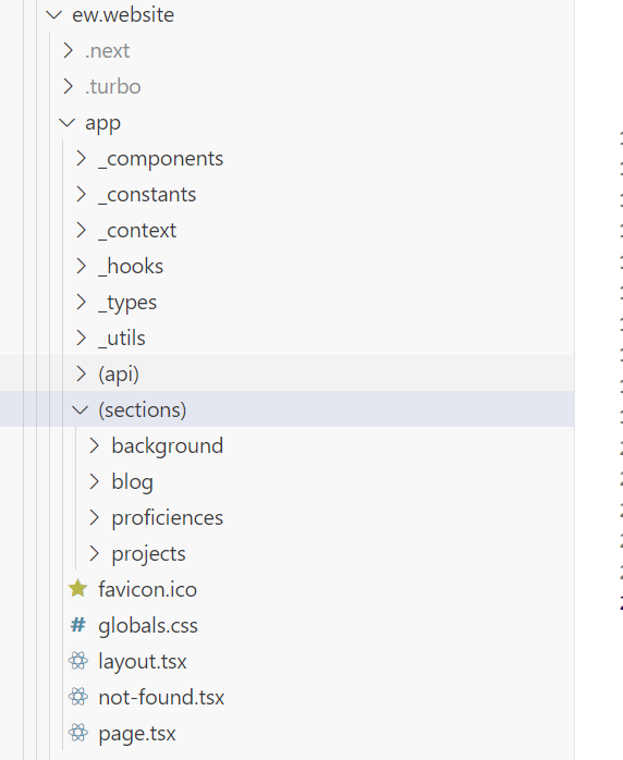
After adding this route handler, my resulting structure looked like the following:

Then on the Storybook side, this was just a plain Storybook project with a few stories built into it. The Storybook can be found here https://ew-monorepo-ew-storybook.vercel.app/.
A small thing that I noticed is that I had my CMS URL added as a public environment variable. This is not necessary as all the data fetching to the CMS occurs on the server, nothing is needed on the front end and therefore does not need to be exposed as a public environment variable and can be moved into a regular environment variable on the server.
One final thing is getting my own custom domain. This was incredibly straight forward and took less than 5 minutes to set up in Vercel and the domain provider I chose.
Problems I faced
Working with Turborepo was pretty smooth overall. The only thing that I found to be a pain was that when I made changes to the shared tailwind config, I would always need to hard restart turbo dev. I tried importing the config into my application to try and force a rebuild but this would not work. Note that I did not search around thoroughly for a real solution as this was not a complete blocker for me, just a slight annoyance. Considering that was the only pain point I had, I would definitely use Turborepo to build a monorepo again!
Interestingly, I found that I needed to remove the backdrop filter blur property from my glass panels, unfortunately. The performance on mobile was not good and I could see noticeable FPS drops, even just on a midrange Android phone. I would rather remove the filter than see any sort of performance issues, and perhaps if the performance of this CSS property is improved in the future then I could opt in to using it then. Further to this, chrome on desktop would occasionally exhibit some strange flickering when using this property, but I could not reliably reproduce the bug so decided to just not use it.
So what's next?
I have learned a lot in the process of this refactor, and I really look forward to building subsequent side projects within the monorepo and to see it expand. The next phase will be a overhaul on the proficiencies page as I think I could present this in a clearer, creative and more fun way.
If you are interested in the setup for the monorepo, take a look at the public repository here.
Written by Ed with no LLM assistance, Keep on codin' ✌️